The Affordable Art Fair was held in Hampstead Heath from 12 to 15 June 2014. The majority of works in the fair were painting, along with some three dimensional works like ceramic, glass, metal sculpture,etc.
Because my project is about fantasy, surreal world, so the works I showed in this post can all inspired me in some way.
1. Content and Shape
 |
Jimmy Lawlor
The boy and his dog are sitting on flying stones, which reminds me floating islands. Floating island as a common element, is always used in speculative fiction, art or movie. Even in the aquascape, it is one of people's favourite compositions. It has a strange attraction. Personally, it can bring me a lot of imagination that I have kept thinking about combine it with my ceramic. |
 |
Amy Elsenfeld
|
There is a kind of science fantasy fiction called planet romance, which is about the geography, civilisation in a imaginary planet. This work just reminds me it. Probably it is because of its texture and colour. Actually I think what I am aiming to achieve is closed to the planet romance.
 |
|
Stefan Mas Persson |
The space in all the urban views he created are presented in a mysterious way, which reminds me Escher's painting and Illusion Graphics.
The following two works have similar visual effect.
I am considering making fantasy world about maze. These works could be interesting reference.
 |
| Hyumjeong Lim |
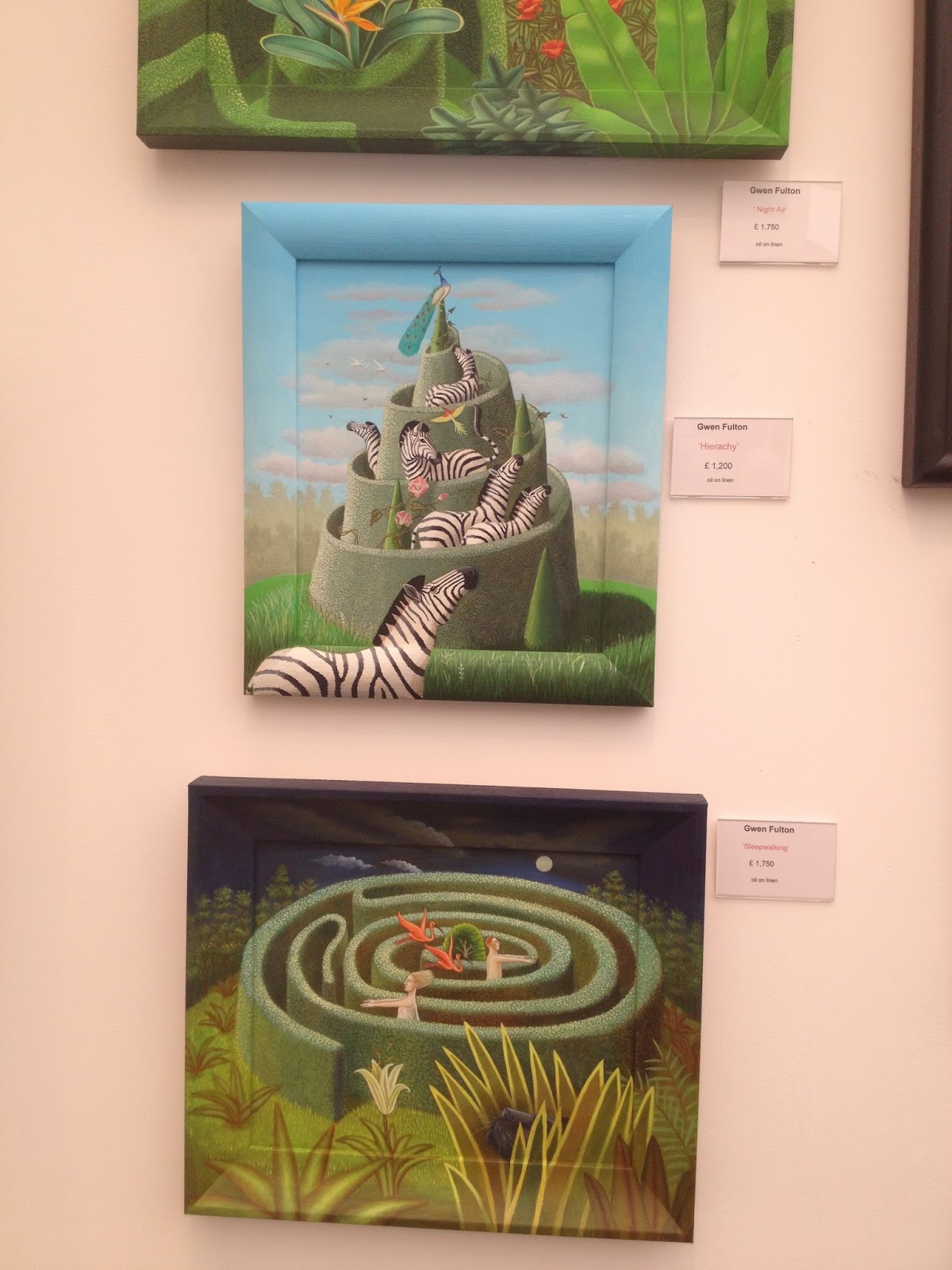 |
| Gwen Fulton |
The colour in this work is similar to one of the effect I want to achieve. The contrast between blue, red and yellow as well as the rough strokes, bringing a powerful tension. It feels weird, but not in a horrible way.
 |
| Stanley Donwood |
This one has similar effect, but feels more exquisite.
 |
| Jasmine Leonard |
This artist is a recent graduate of Wimbledon. Main materials she used are spray paint, with oil and acrylics. Her works is about collective memories, expectations, showing her experiences of the natural world, such as botanical gardens in the above work.
This is one of my favourite work in this fair. Even I put it in the colour section, I also like the rest of this painting, such as the strange lamp-like stuff in the glass cover and plants behind it. They look like coming from nowhere, just appearing in this blurred space.
Her colour is so close to my ideal colour. I really like the partly transparent effect she sprayed with paint. I am going to find I how can I achieve these colours with glaze.
 |
| Theresa Pateman |
This one gives me a sad and bleak feeling, a feeling about dying, time and passing.
 |
| Daniel Ablitt |
 |
| Daniel Ablitt |
This piece of work also has a colour matching of yellow and blue, but it shows a more quiet and comfortable feeling.
 |
| Beth Nicholas |
Here is another my favourite artist here. She predominantly works with blown ink, oil bar and water washes on paper. The core of her current work is inspired by Japanese aesthetic of Wabi-Sabi, exploring the beauty in transience. Her landscape like painting is just like the photography took from a plane or satellite.
I appreciate the enchanting colour and texture in her work, full of details but still natural and full of vitality. I always want to achieve this kind of effect. The reason I chose to work with ceramic is because some glaze can achieve similar effect.
However, recently my interest is waving between this and more artificial effect, like last few pictures I showed in the section 1.
 |
| Beth Nicholas |
This artist's style is quite similar, though not as mature as the previous one.
3. Technique
 |
Jason H Green
|
 |
Jason H Green
|
This is a couple of ceramic work. The materials are terra cotta, slip, glaze. I am surprised about its semi-transparence and stained-glass-window feeling in the cathedral.
I would like to have a try of colouring in this way, since I am still finding the style of my work.
 |
| Fenella Elms |
I am really curious about in what way that she can manipulate porcelain like noodle. This work is not the craziest one, cause is inserting in a glass or something. Many of her fragile work are freestanding.
 |
| Francesco Bruni |
This is a group of ceramic work. The way this artist made these little houses and the strokes on them interest me. I think he used very dry coloured slip to create those strokes. I can have a try in my work.
 |
| Pierre Williams |
As to this one, the collage makes me think about parallel worlds in the surrealistic painting, because each piece in it has its own colour and pattern. With their boundaries connecting each other, these pieces are like partly separated worlds.
 |
| Reinder Ourensma |
I was wondering it would be fun if I build my work with bricks like this in different colours.


No comments:
Post a Comment