This glaze test is based on the recipes I found in a book about ceramic artist Hazel Johnston. This book,which is mainly about a interview between Johnston and the author, is nice that presents many aesthetically appealing works of hers. At the end of book, she provides some of her recipes.
What I found inspiring is the peaceful and elegant feeling in her work, which allows me to imagine their smooth tactile surface. I would like to achieve this kind of effect on my work, so I made these glazes according to the book.

I made one a dolomite glaze as a base and three types of pigment mix. Here are the recipes.
Dolomite glaze
Potash Feldspar 24.4
Cornish Stone 42.4
China Clay 25.1
Dolomite 32.4
Whiting 3.5
Pigment Mix 1
Blue: Cobalt( measured in level teaspoons)
1 Part Cobalt Oxide
1 Part Iron
1 Part Manganese
Pigment Mix 2
Brown: Bronze
5 Parts Manganese
3 Parts Copper Oxide
1/2 Part China Clay
Pigment Mix 3
Green: Copper Mix
( She didn't give, but I try to mix by myself based on a copper glaze)
I applied them to both terracotta clay and porcelain.
————————————————————————————————————
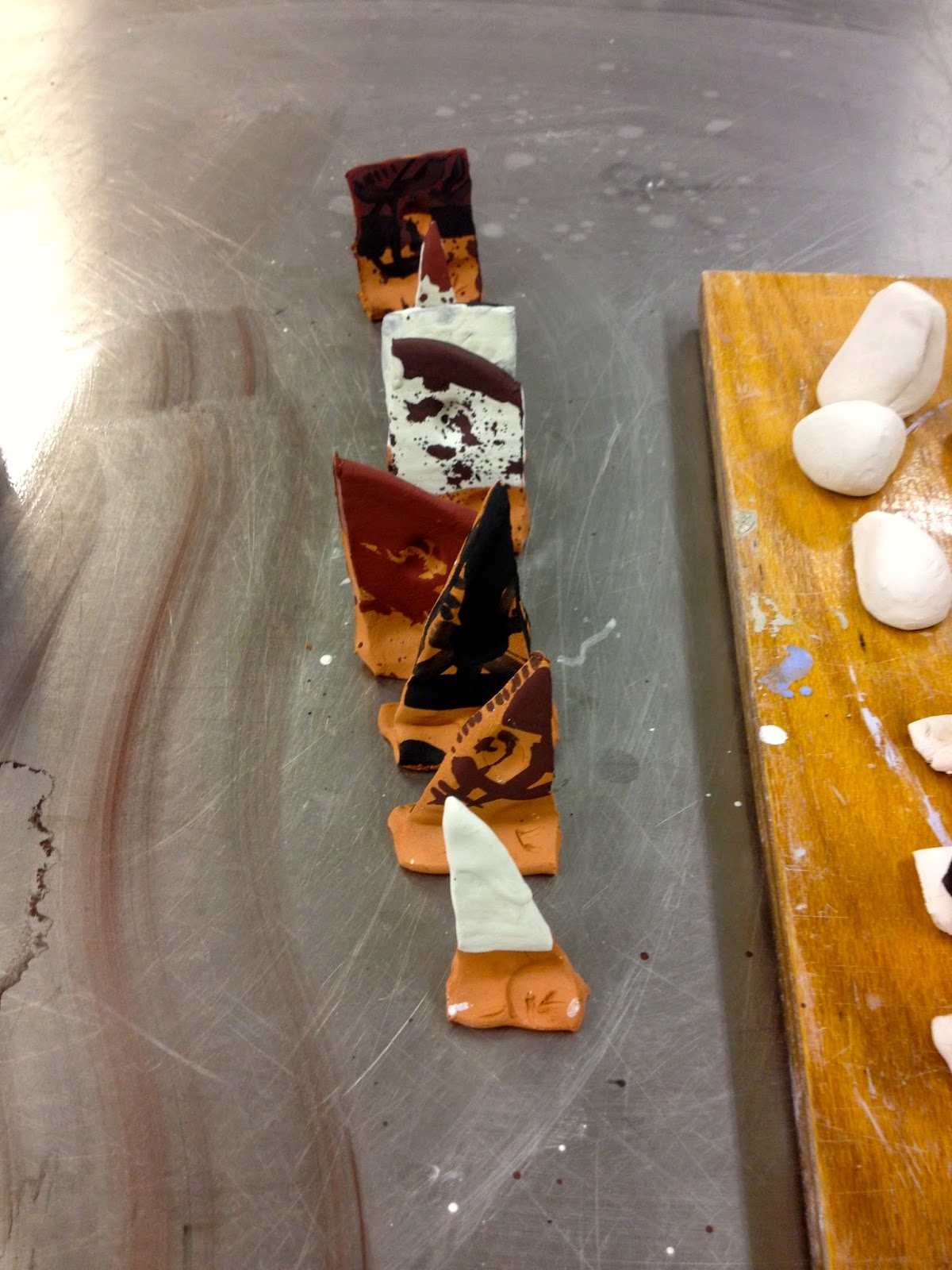
1. Terracotta
Here are the pictures before and after firing. I brushed pigments in different thickness and shape on the surface of text pieces, expecting to achieve various results.

 |
| (1) dolomite glaze |
 |
| (2) cobalt pigment |
 |
| (3) bronze pigment |
 |
| (4) copper pigment |
 |
| (4) copper pigment |
 |
| (5) dolomite+cobalt /cobalt+dolomite Johnston normally sprays pigment first, then spray another layer of dolomite glaze. Here I tried both orders, but I only used brush. Before glaze firing, if I brush the pigment first, the second layer of dolomite glaze mixes with the pigment during brushing. But, if I do it in an opposite order, the layer of pigment stays on the surface of dolomite glaze. However, they look basically the same after firing. |
 |
| (6) dolomite+bronze /bronze+dolomite |
 |
| (7)dolomite+copper /copper+dolomite |
 |
| (8) cobalt+bronze |
 |
| (8) bronze+ copper 2. Porcelain |


 |
| (1) dolomite glaze |
 |
| (2) cobalt pigment |
 |
| (2) cobalt pigment |
 |
| (3) bronze pigment |
 |
| (3) bronze pigment |
 |
| (4) copper pigment |
 |
| (4) copper pigment |
 |
| (5)cobalt+dolomite |
 |
| (5) dolomite+cobalt |
 |
| cobalt+dolomite and cobalt |
 |
| (6) bronze+dolomite |
 |
| (6) dolomite+bronze |
 |
| (6) dolomite+bronze and brozen |
 |
| (7)copper+dolomite |
 |
| (7)dolomite+copper |
 |
| (7)copper+dolomite and copper |
 |
| (8) cobalt+bronze /bronze+ copper |
 |
| (8) bronze+ copper |
Results:
The result of this experiment is not what I expected. The colour of the pigments have turned into metallic black colour in different tones. Here are some reasons.
1. Reliability of recipe
I am not saying that this artist wants to confuse her readers, but the recipes seem quite different from the glaze or slip recipes in other specialist books. For example, these recipes require teaspoon measurement, which I found is not accurate enough. This taught me being accurate and scientific is rely important. This is also a problem when it comes to the measurement of water. There is no indication that how much water should be added.
I discussed my confusion with Yuta, who is a expert of ceramic in my major. In his opinion, the recipes of pigment are wrong. Next time, before I start to make glaze, I should discuss with professional people first.
My guess is I put in too much of the oxides. Because after I fired them, I saw something about the colour of oxides in a book about glaze. It said oxides in glaze should be lower than 5% ( I have to check it again). Copper for instance, when it reaches its saturation, it turns into metallic black. I think that is what happened here, as I can still find some green colour at the edge of black, which has less copper. Again, this makes me realise how important is the accuracy.
And when I ask Yuta whether I can add more water in it to make it more watery. He said the problem is not about water that I should not do that. However, I do not really understand his answer. In order to solve my confusion, I would discuss this with our technician.
Nevertheless, I don't want to waste these glazes that I am going to experiment with them. So here is my plan.
Nevertheless, I don't want to waste these glazes that I am going to experiment with them. So here is my plan.
Divide every glaze into two parts,
Part 1. Add more water and spray little on the test piece.
Part 1. Add more water and spray little on the test piece.
Part 2. Add 100% percent of china clay and other ingredients as base.
I think these are two ways of getting the concentration of glaze lower. Though I do not know whether it works.
2. Temperature
In the terracotta test, they were accidentally fired at 1260, which is too high for them. So they all look a lit bit over-cooked.
————————————————————————————————————————
However, as a black slip with strong metallic feeling, they are quite good. And they have different hues of black colour, especially the bronze one with dark golden colour. Even though they are not what I am aiming for, they can be useful in other applications.
————————————————————————————————————————
Here is a piece that I glazed with my previous glazes. It turned out differently again. It looks quite creepy, but in a lovely way.

I used a yellow glaze at the ring of this piece, which is the test piece on the right, but it vanished completely. And the left test piece was a mixture of a purple glaze as base and a white glaze on the top. I supposed I used too much white glaze this time that the colour of glaze did not really stick on the work. Next time I should try different combination of them, and see how it goes.
In conclusion, the glaze test 3 has reinforced the importance of preciseness. I will make better plans when I experiment in the future.


