Search This Blog

Wednesday, 15 October 2014

Fantasy Landscape Experiment - Dyed Plaster Samples 2

In the second day of making the samples, I gained some pieces in really strange colour. Firstly, their colours were too strong, which was a little disturbing and like poison. To achieve a feeling of fantasy, I chose vivid colours. But it seemed that I lost my control and put too many dyes in the plasters. 


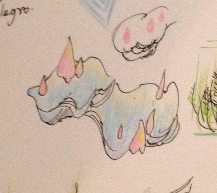
This piece presents a landform that inspired by plesiosaur's fossil and hills in Cappadocia area in Turkey. Though the form of it was not fully in control, it still can express a basic idea of mine. 


I had some difficulties of using blue. I couldn't get the right colour that I want. I tried different blue dyes and percentage, but the colour still looked not good. It may to do with the colour that go with it or the plaster itself. The plaster is not pure white, which is slightly greyish. Sometimes the colour looked good in the water, but after adding plaster, it became strange. I know that they are just samples and I may face other problems when using glaze. But if they are in a wrong colour, how can they function as a sample or a guide. 


 Secondly, the fabric dyes are becoming weirder during drying. My guess is when the moisture came out, it also brought the colour inside the plaster to the surface, which makes the colour of the works stronger and darker. 


 Like this one, the colour was acceptable at the beginning, then it turned out like the pictures showed blow. And I found there was some salt in the fabric dye for colour fixing, which gradually came out to the surface of the work and became white crystal.


In the picture blow, I really like this colour combination and rich details in it, even it is getting darker. I used acrylic paint in the yellow part mixed with a little fabric dyed purple pink plaster, which gave a smooth cream-like texture. When I poured the purple pink part, it was dryer and formed rock-like texture. 


After I put it into the drying cabinet, the purple pink became stronger and looked about to burn. But not so bad compared to the other pieces.


I had a tutorial with Shane today that he suggested I can make the form first and then paint on the plaster when it is still wet. In this case, I can have more control of the colour. I will try this way later. But the good part of the method I am using now is that I can carve the work freely without worrying about losing colour.

Monday, 13 October 2014

Fantasy Landscape Experiment - Dyed Plaster Samples 1


Basically, I am now working on creating the setting of a fantastical land. The land has no human being, and in the ancient time, the time of all the species has been stopped. They were frozen at the moment when they tried to escape from this unknown power. Physically they are dead, but their time is stopped. And after so many years, the land is drown by ocean and new life starts. So based on this setting, I will design a serious of landforms with creatures on them, and tell their stories. It is a little bit like Luigi Serafini's Codex Seraphinianus, but I also get a lot of inspiration from Journey ( Thatgamecompany, 2012).

Back to the test, these plaster samples are made for quickly expressing some of my ideas of landforms in 3D.  It can be quite different after sketches are made in to 3D forms. The idea of the world where these landforms exist is that countless creatures were frozen at the moment that they gradually became part of the landforms. Imagine a large group of sardine is swimming around and they have been stopped and kept in that position at a certain point.

Fantastical colour is one of the important part in my work that I decide to dye the plaster. Firstly, I tried fabric dye. It was a little hard to melt all of the fabric dye in the cold water that it can be lumpy. But the colour coming out was not bad.


Green


Purple Red


This one sets in an underground cave that all the creatures are trying to get out through the whole on the top. I was working on carving the details of the creatures, but the plaster was too wet that I had to do it later.  To me, the colour combination of purple and green always has a sense of weirdness and mystery. Though the colour is not the same as I thought, it is worth trying.


I used acrylic paint at the orange parts which formed a texture of melting wax. In the purple red part, I mixed a little yellow acrylic paint into purple red fabric stain dyed plaster. They have different textures due to paints and the humidity of the plaster.


I used dark blue acrylic paint here. It turned out as a greyish blue which was not so ideal. It is better to use another kind of blue next time, with lighter and greener colour.


 Watercolour paints were used in this one which gave brighter and pinky colour, like marshmallow.


After they dry out, the colour may be different. But overall, I quite like the samples this time, and I will keeping working on them tomorrow. 

Friday, 10 October 2014

Underglaze Test 1


This test is for the piece above, and I would like to do some test about underglaze. I quite like the matt clay-like finishing, and underglaze won't flow down which is suitable if I want to do gradually changed colour.

Because I bought some body stains before that at the beginning, I wanted to make underglaze by myself. Through my research, it seems that underglaze and engobe basically are the same. If the piece hasn't been bisque fired, I can use coloured slip mixed by slip and stain, which would be easier. However, test pieces and the piece above are all fired, and slip won't be able to hold the clay body that I have to use engobe. I found some recipes online which are following attached, but we don't have some of the materials in the glaze room. And I couldn't find relevant information in the library. In the end, I decided to buy some underglazes from Tiranti.


Here are the test pieces. Their colours look quite nice which are what I want. Hope they can be like this after firing,


Later, I managed to fine a recipe from the book I borrowed from library today that I maybe can try it next week. This book is called The Potter's Bible, by Marylin Scott. It is really clear and straightforward which is nice for a beginner like me.

White Stoneware Engobe

Flint 10
Potash Feldspar 10
China Clay 10
Ball Clay 5
Nepheline Syenite 5


Saturday, 4 October 2014

Record: Change of the Aquarium


This is the setting that I showed in interim show. 

1. the first day


2. after a week


3. after two months

Richard from Photography Department helped me shooting these photos. We set a flashlight with its umbrella at the right upper side of the tank. At the same time, black cards were used at different places to prevent reflection, especially the front of the tank. We took about 300 photos, and these are just nine of them.

It can be seen that the setting changed a bit after the show. The background plants and moss grow crazily and the new plant I tried in the front are not doing so well. The light I am using now is way too weak. There are 30 or even more baby fishes in the tank and the baby shrimps are growing well. This proves that the tank is in a relevantly good and balanced condition. Though there is some algae appears on my work in the front.


This tank may stay like this for quite a while and I will use something else to test my new ideas.