The overall feeling that Design Junction gave to me is young, thriving, and vivid. There were many products had a sense of friendly and warm.

This is a conceptual design shows that when people drive, there is a transparent information zone around them. They can choose the style they want. This probably will become a part of our daily life, but for now I have no idea how people can focus on driving when they are such a chaotic environment. The video looks really cool though.


The candle holders and the plates are found in the same shop. They have a strange black humour. On the candle holder, the wax on the boy's face looks like his blood. The fish and chips one reminds me one of my proposal for the Urban task that given by Barnaby.


I really like these two chairs, from their elegant and light form to their comfortable colours. They are the chairs that I will want to have one at home. The oval shapes on the back of the chair recall me the tail of peacock. I had a seat on the big one, it was surprisedly stable.

The background of this lamp is dark grey green, which is not shown in the photo. When the yellow light shines through the wholes on the lamp, forming this colourful overlaid shape on the background, it is really splendid.

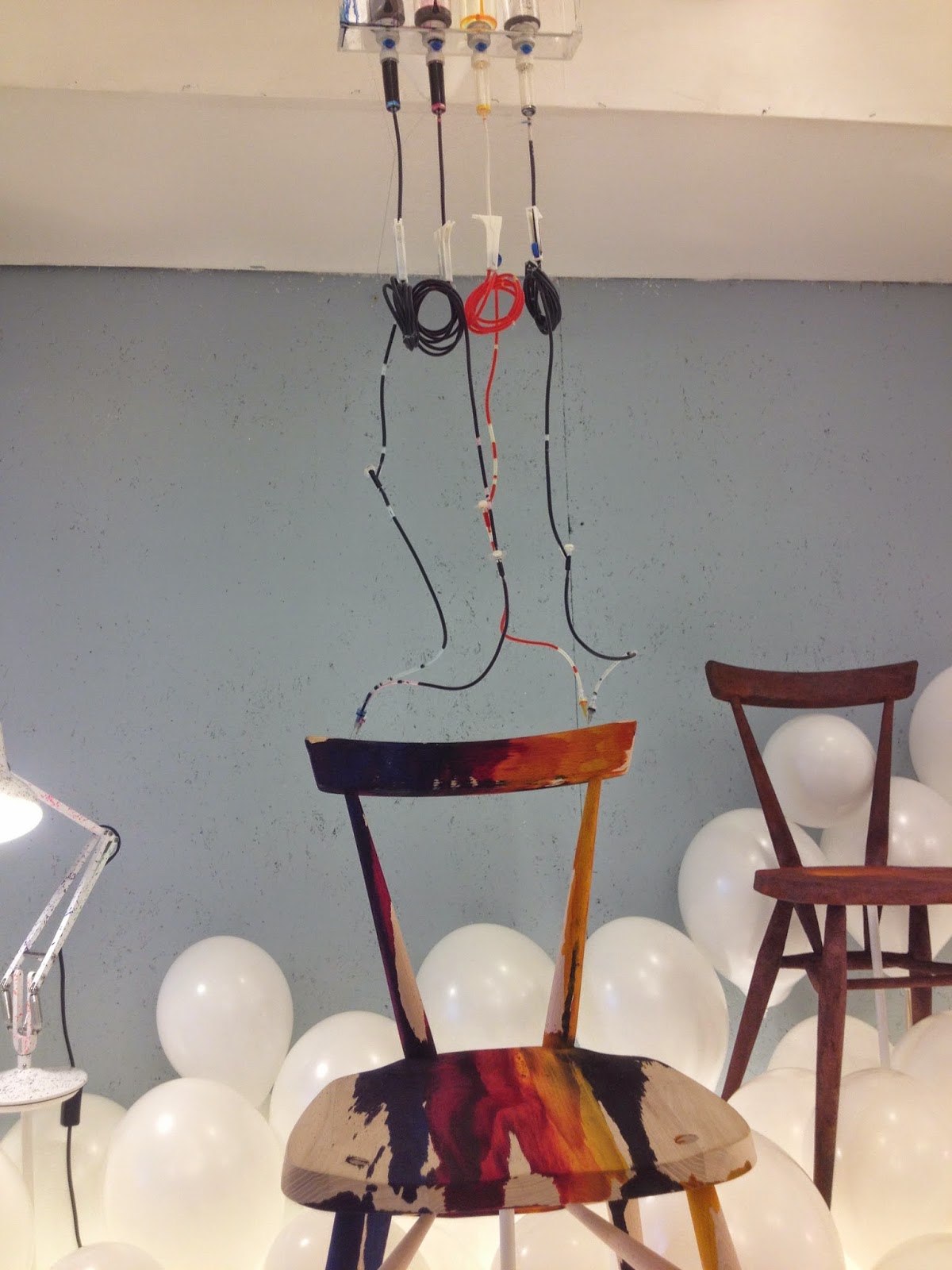


This table reminds me Kasia's project.

It is hard for me to recognise the cover of these two works are made of ceramic, even I touched. I really like the ink-like texture on the surface as well as the colour combination of green and purple. I am admired that the designer can control the accuracy so well, since the inside of the work has to fit the cover after the cover has been fired.

This light is really funny that it can hold its balance and swing on the stick.


This artist covers the glass with copper sheet during making, and then the copper left this beautiful orange colour on the glass. The colour feels so natural.
No comments:
Post a Comment